
Summary / Overview
In addition to a new design, the MSO dashboards offer a wide range of functions and serve as a business intelligence tool for analyzing data cubes. The central function of the new feature – in addition to the improved clarity – is the dashboard designer. This allows users to interact individual elements with each other to create customized filter options. This allows you to tailor the dashboards to your own requirements. The available elements include image and text fields, charts, (pivot) tables, indicators, progressions, (regional) maps and global or predefined filters.
Table of contents
-
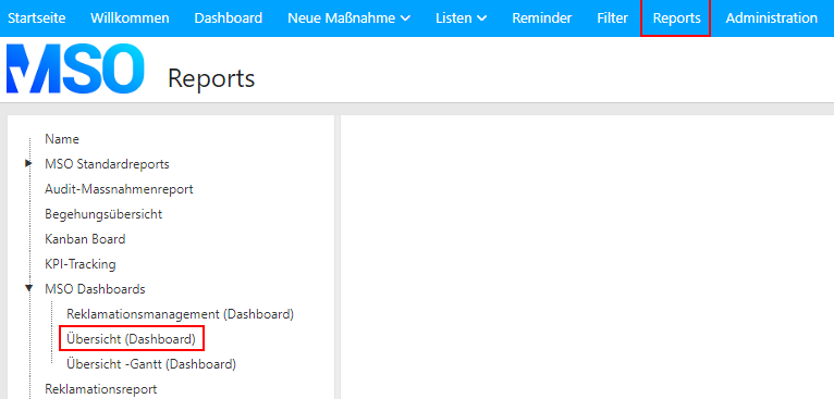
1 New display of ratings
-
2 Parallel processing of status steps
-
3 Images in activities
-
3.1 Definition of a new dashboard
-
3.2 Dashboard Designer
-
3.2.1 General
-
3.2.2 Design dashboard
-
3.2.2.1 Creating a new dashboard
-
3.2.2.2 Table
-
3.2.2.3 Diagram
-
3.2.2.4 Instrument
-
3.2.2.5 Pivot table
-
3.2.2.6 Indicator
-
3.2.2.7 History
-
3.2.2.8 Map
-
3.2.2.9 Image
-
3.2.2.10 Text
-
3.2.2.11 Global filters
-
3.2.2.12 Predefined filters for individual elements
-
3.2.2.13 Interactions
1. Display MSO Dashboard
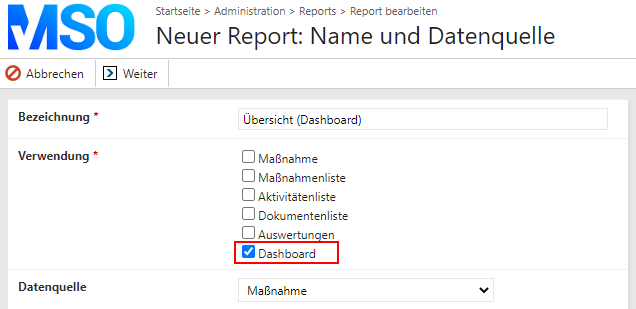
A dashboard created using the Report Designer can optionally be displayed in up to two different places: (1) Reports; (2) Dashboards;
(1) If you select the “Reports” option when creating your dashboard, the dashboard can be accessed and analyzed via the “Reports” tab, just like all other reports.
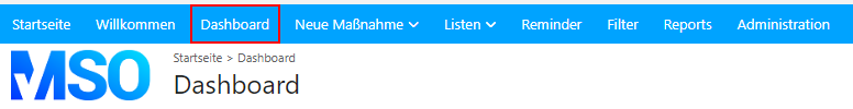
(2) If the “Dashboard” usage is selected, the dashboard appears after calling up the “Dashboard” tab. It is important to note that only one dashboard can be selected for this display. This means that the dashboard selected first is always visualized in the corresponding tab.
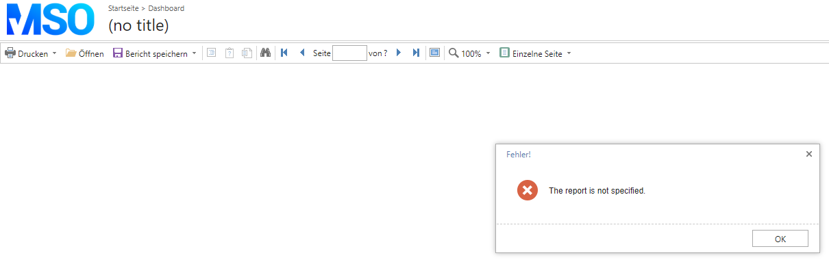
Note: If you open the “Dashboard” tab although no dashboard/report has been selected for use in the dashboard, the following message appears:
Note: If you cannot see the “Dashboard” tab in your application, this function must still be activated for your application by MSO. Accordingly, please contact us directly.
2. Use MSO Dashboard
MSO dashboards offer a wide range of functions and serve as the perfect BI tool for analyzing your data cubes. The respective functions are defined as part of the creation process (see chapter 3) and can therefore vary.
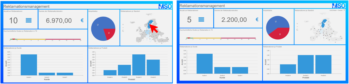
(1) A major advantage of MSO dashboards is that several diagrams can be displayed on one page and that clicking on a specific area in a diagram filters all other views to this area. If, for example, only complaints relating to the country Sweden are to be displayed in a complaints dashboard, the entire view can be filtered by clicking on the corresponding map section. (As an alternative to a filter function, links can also be opened by clicking on certain areas of the dashboard, allowing measures to be edited directly, for example).
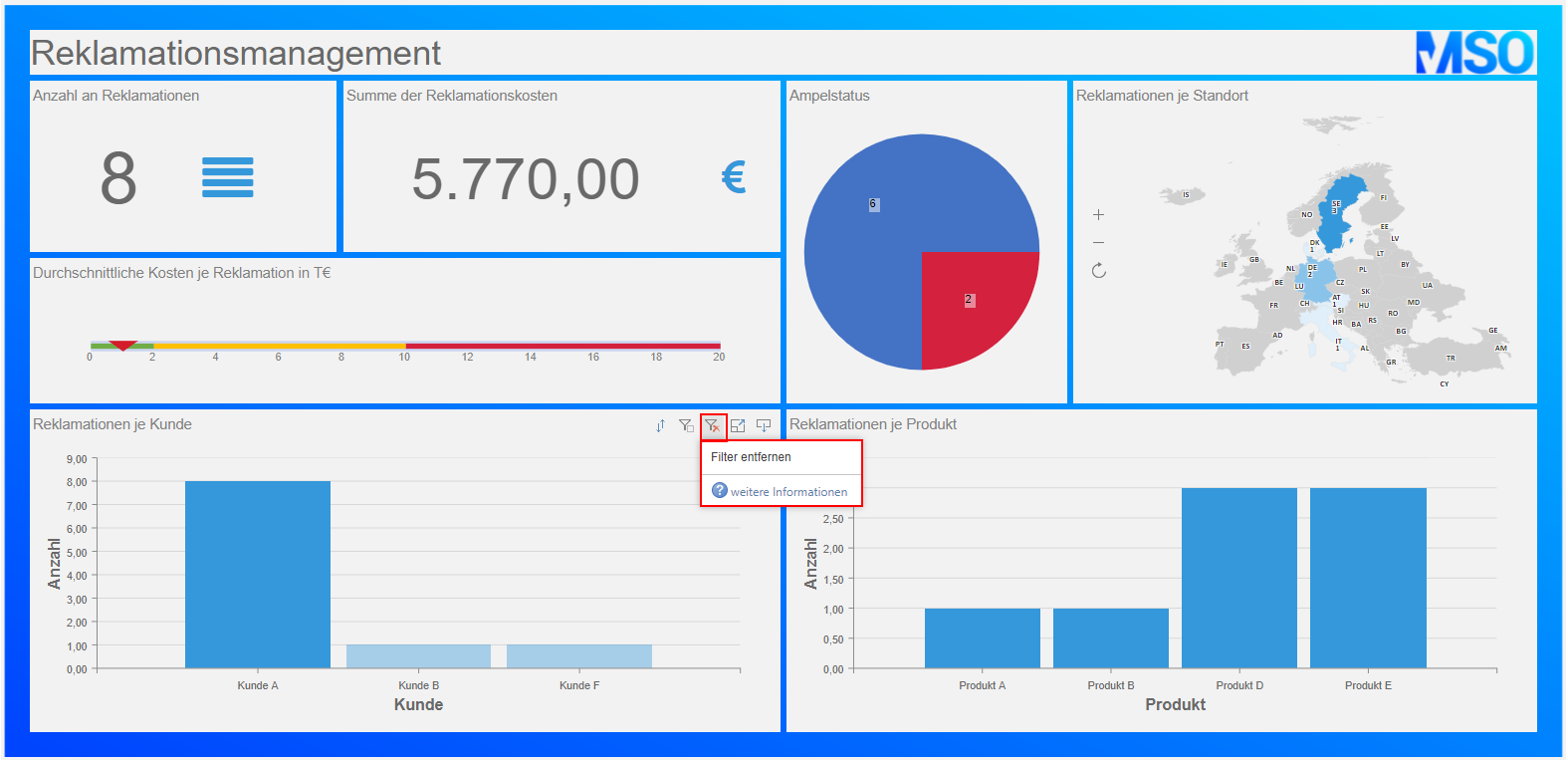
(2) If a filter is set by clicking on an element of a diagram, it can be removed again by clicking on the filter symbol at the top of the respective diagram.
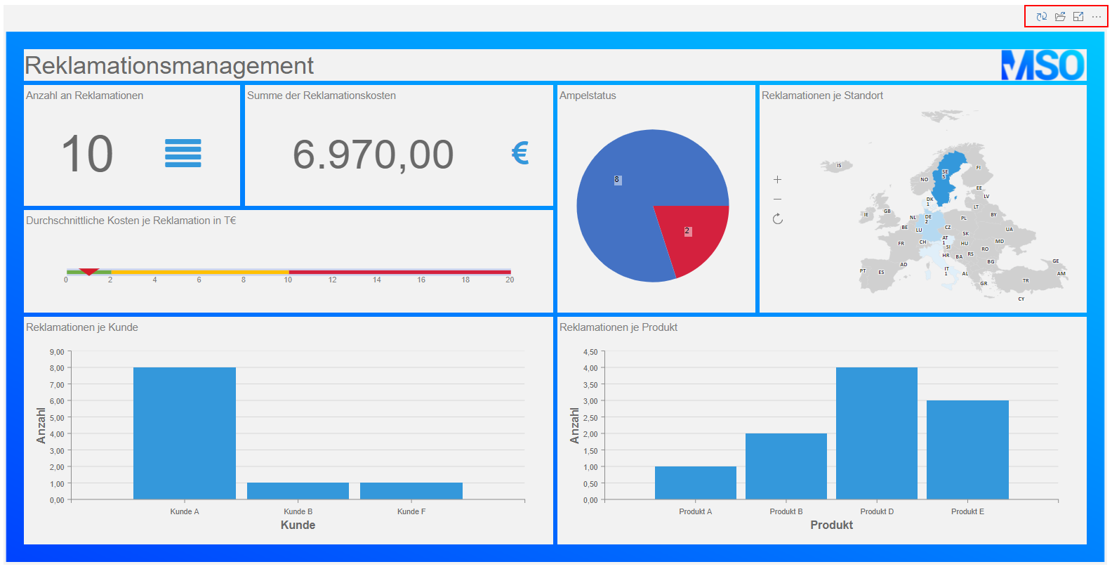
(3) In addition to the filter function, each individual diagram can also be re-sorted, displayed in full-screen mode and exported as a .pdf, image or Excel file.
(4) In addition to these functionalities per diagram, the dashboard can also be displayed as a whole in full-screen mode and exported as a .pdf, image or Excel file. The corresponding buttons are located above the dashboard. The dashboard data can also be updated at this point.
3. Create MSO dashboard
The creation of dashboards is very similar to the already familiar procedure for creating reports. The most important steps for creating a dashboard are described in the following chapters. For a comprehensive description of all functions, please refer to the report/dashboard designer manufacturer’s manual: https://www.stimulsoft.com/en/documentation/online/user-manual/index.html?dashboards.htm
3.1 Definition of a new dashboard
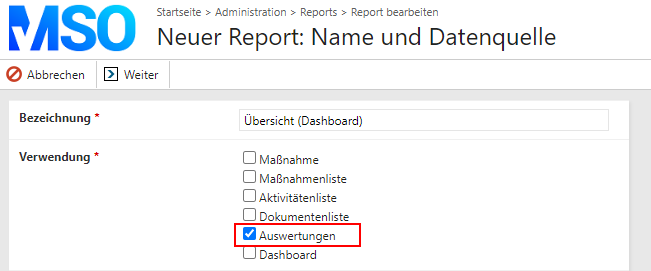
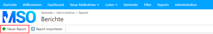
(1) To create a new dashboard, first switch to the administration area and select the “Reports” field in the “Other settings” section.
(2) Then click on “New report”, whereupon the definition window for a new report or dashboard opens.
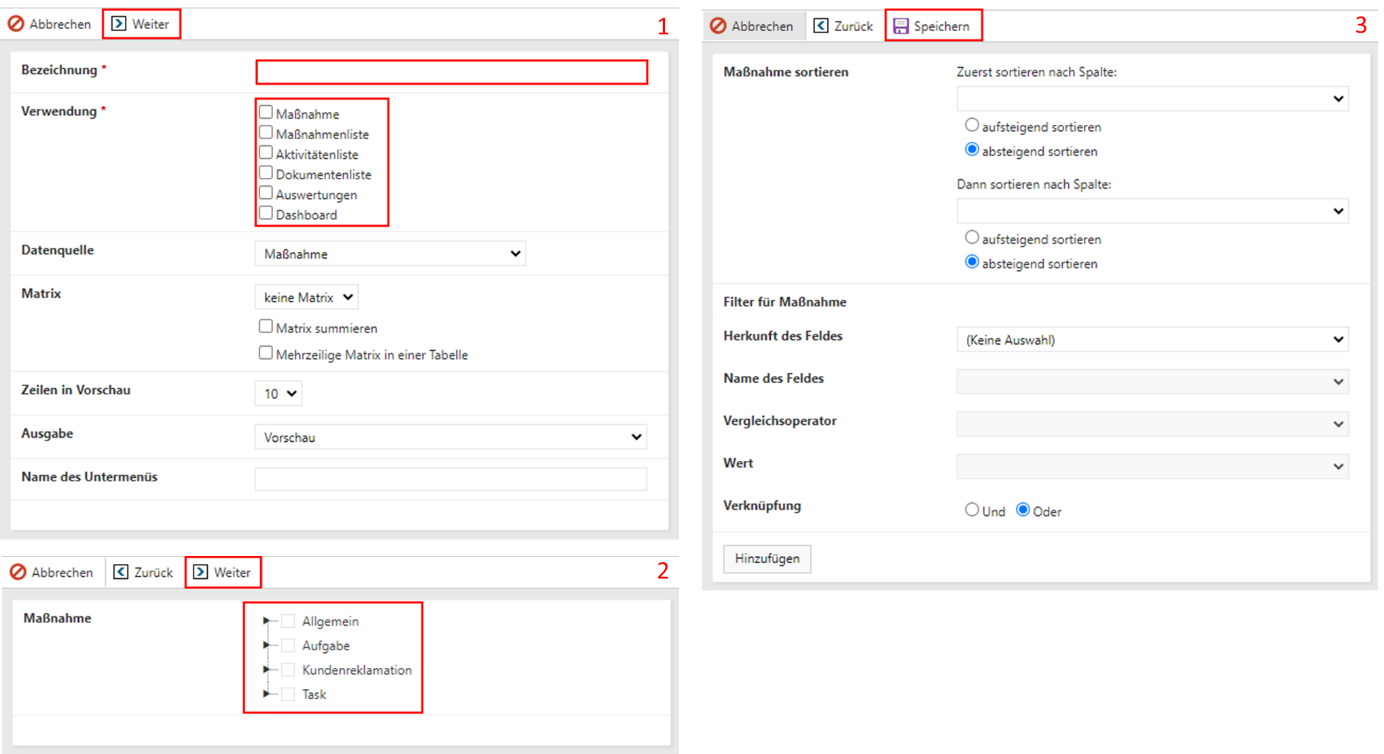
(3) Give your dashboard a name and specify where the dashboard should be displayed (see chapter 2) (1). After clicking on “Next”, you can determine which database fields you would like to use in your dashboard. In addition to a few general fields (ID, Title, Status, Responsible, Responsible, ….), it can also be useful to include categories, global fields and event-specific data (2). Once you have selected all the fields, you can confirm your entry by clicking “Next”. Before you can start with the actual creation of the report, you must finally specify whether you only want to use data from a specific event (filter function) and whether the data should already be sorted (sort function) (3). These two functions are optional. Click on “Save” to save all entries and the program automatically opens the report/dashboard designer.
3.2 Dashboard Designer
3.2.1 General
The user interface of the report/dashboard designer can be divided into three sections: Menu (1), Properties (2), Page/Dashboard(3).
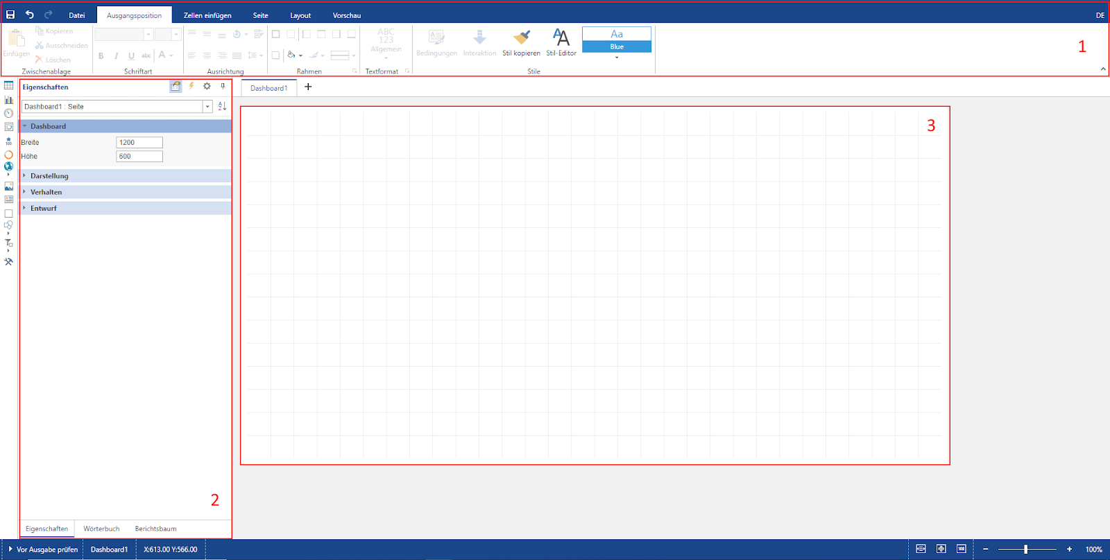
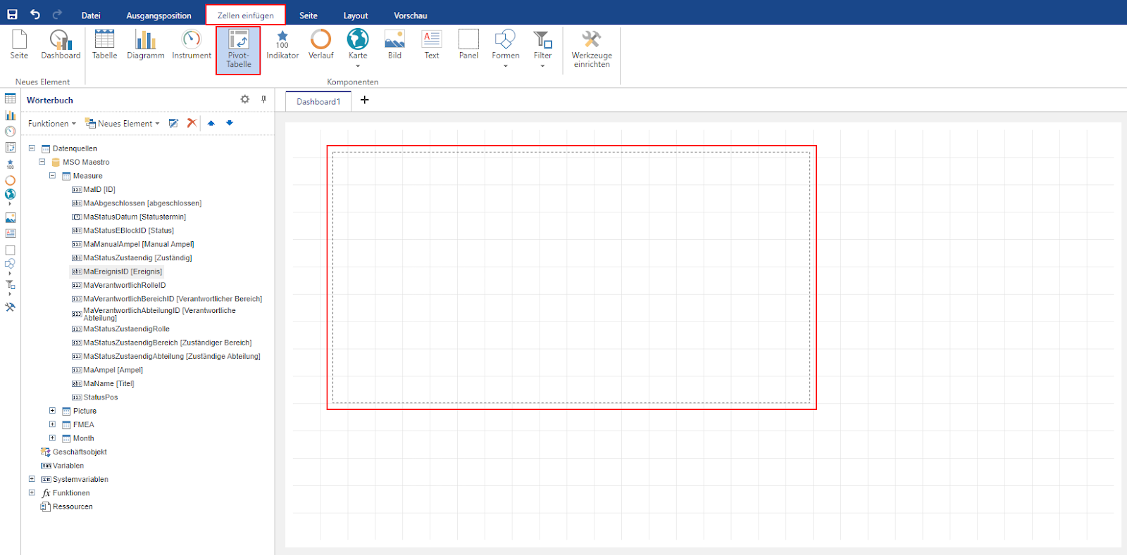
(1) The menu consists of a total of six tabs, “File”, “Home”, “Insert cells”, “Page”, “Layout” and “Preview”:
File: Save all changes, exit the Designer (back to the database) and call up the documentation.
Starting position: Editing of all texts and fields (font size, color, background, frame, … ? compare with Microsoft Word)
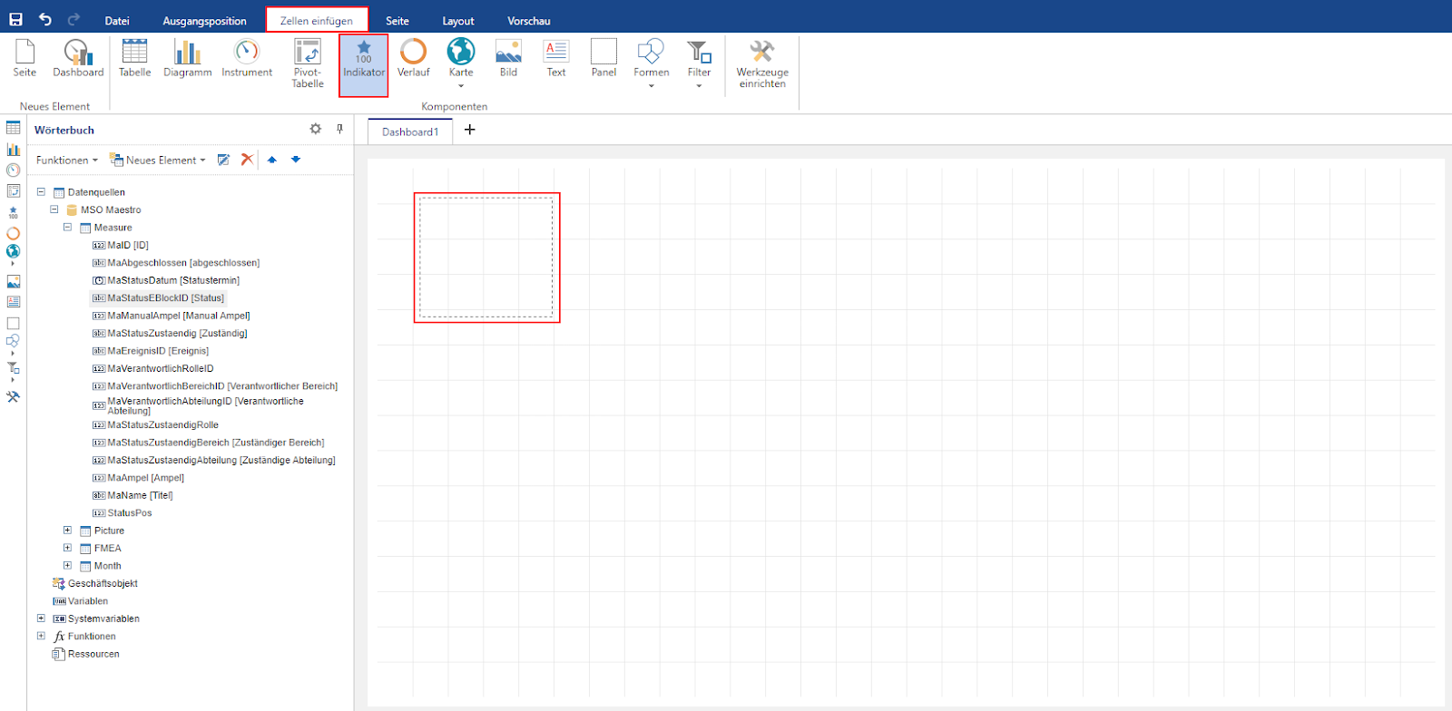
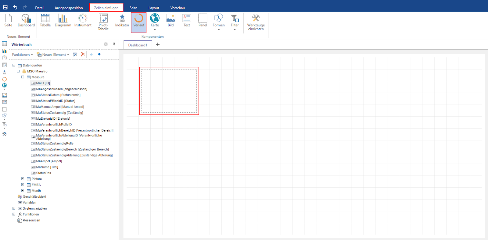
Insert cells: Add new dashboard elements (tables, charts, instruments, maps, text fields, images, indicators, filters).
Page: Definition of the page layout (between desktop and mobile application).
Layout: Editing the positioning of individual elements in relation to each other (“In the foreground”; “In the background”).
Preview: Preview of the created dashboard as it would be displayed in the database.
(2) The properties contain a total of three tabs, “Properties”, “Dictionary”, “Report tree”:
Properties: Each inserted element (table, diagram, …) has different properties, such as the labeling of the x- and y-axis. These properties can be edited accordingly at this point.
Dictionary: Display of all data fields that have been transferred from the database to the reporting tool as well as a list of all newly calculated data columns or added data sources.
Report tree: Hierarchical display of all elements used in the report. Can be used for quick navigation as part of dashboard creation.
(3) The page represents the actual dashboard. All fields can be inserted here and positioned as desired (within the specified frame).
3.2.2 Design dashboard
3.2.2.1 Creating a new dashboard
By clicking on the “plus symbol”, you can insert both a new report page and a new dashboard. To add a new dashboard, please click on “New dashboard”.
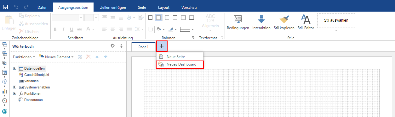
Note: To display only the dashboard, the page that already exists by default (Page1) must be removed. This can be done by right-clicking on the “Page1” tab as soon as the new dashboard has been inserted.
3.2.2.2 Table
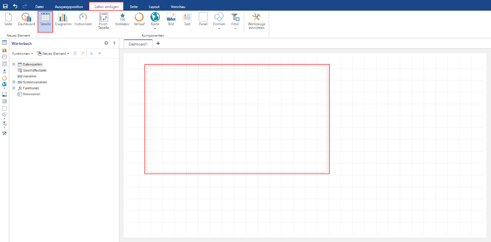
Various elements can be added to the dashboard using the “Insert cells” tab To insert a new table, the “Table” button must first be activated. The desired position of the table can then be drawn in the dashboard.
To display the desired data in the table, any elements of the dictionary can be added as columns. A new column is added to the “Table” field using drag & drop.
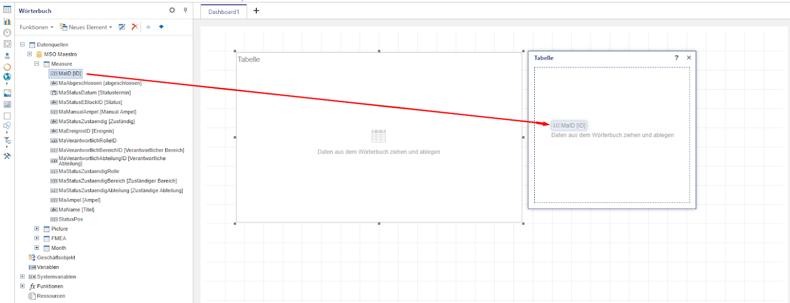
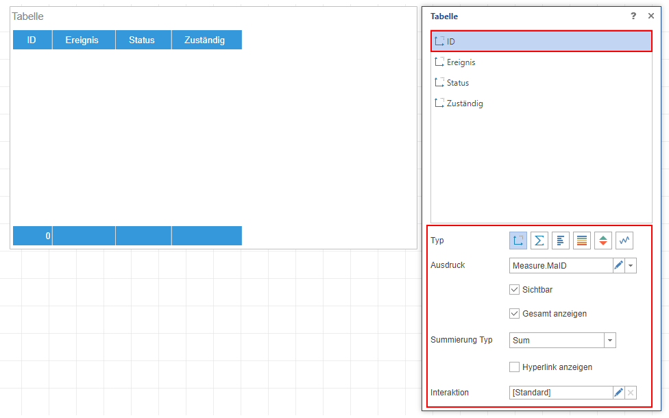
As soon as all the desired columns have been added, they can be edited further. For each column, you can specify whether it is to be displayed as a simple dimension, measure, bar, color scale, indicator or chart. In addition, you can also decide whether the table should have a result row and how this result is calculated (Sum: sum of all values; Min: smallest value; Max: largest value; Count: Number of all values; Average: Average value). Finally, the interaction can be used to define what happens when a corresponding cell in the table is clicked.
3.2.2.3 Diagrams
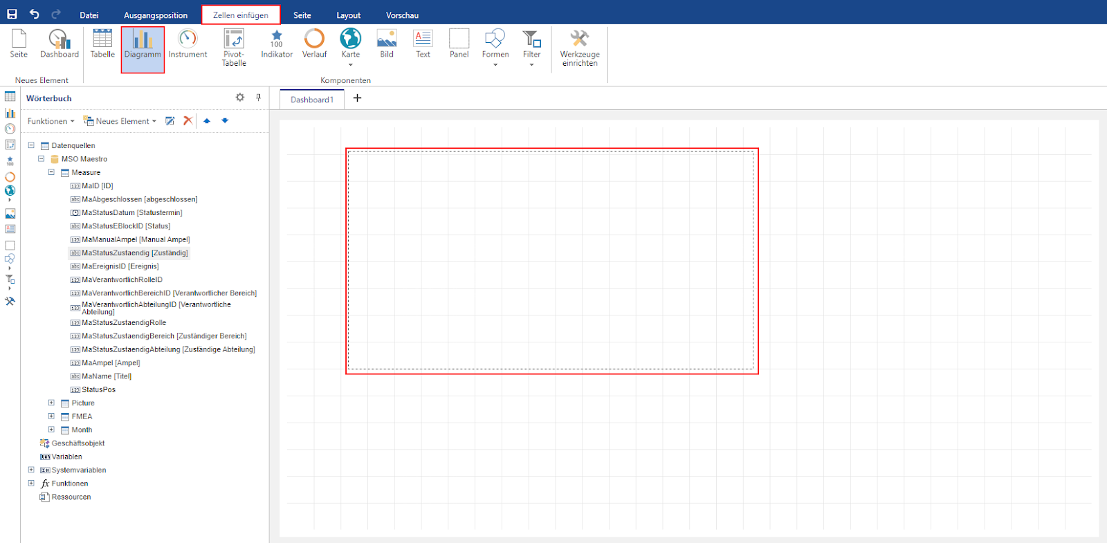
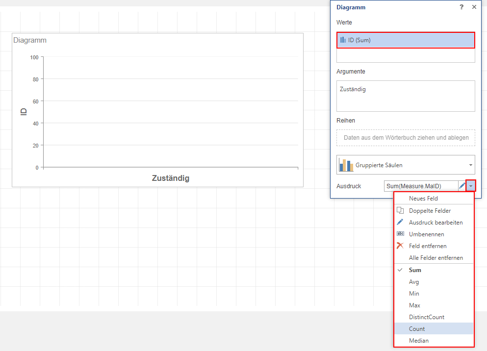
To be able to insert a new diagram, you must be in the “Insert cells” tab in the menu bar. As soon as the “Diagram” button has been activated there, the placeholder for a new diagram can be drawn in the dashboard.
Data fields from the dictionary can then be dragged and dropped into the diagram. The default chart is a bar chart. Data columns that are dragged into the “Value” field therefore correspond to the y-value and data columns that are dragged into the “Argument” field correspond to the x-value of a classic diagram.
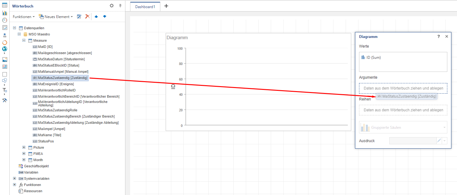
As soon as a data column has been defined as a value and this value has been selected with a mouse click, the chart type can be selected. A variety of common diagrams are available here: Column diagram; Line diagram; Area diagram; Range diagram; Bar diagram; Scatter plot; Pie chart; Network diagram; Funnel diagram; Financial diagram; Gantt diagram; Ring diagram; Bubble diagram; Sunburst diagram; TreeMap; Pictorial representation; Waterfall diagram
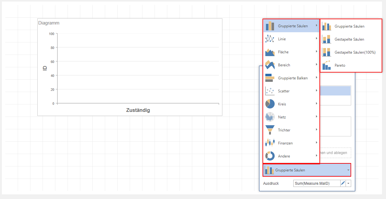
Regardless of the type of diagram, you can specify for each value how it should be calculated depending on the argument. To do this, the corresponding value must first be selected with a mouse click. The expression can then be edited and all available mathematical operators (Sum: sum of all values; Avg: average value; Min: smallest value; Max: largest value; DistinctCount: Number of all unequal values; Count: Count: number of all values; Median: median of all values) are displayed. Click on the desired operator to customize the printout and the graphical output.
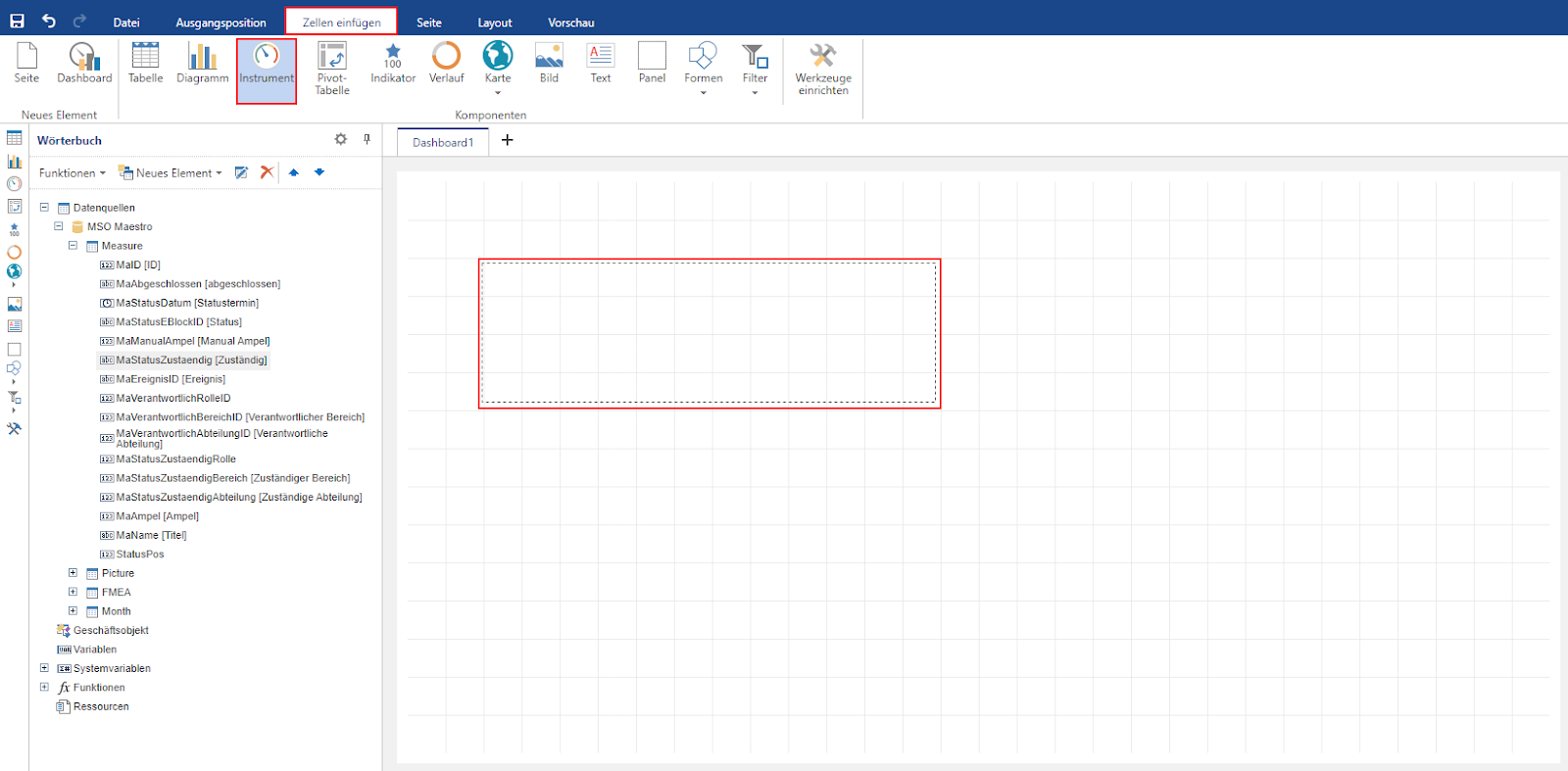
3.2.2.4 Instruments
A new instrument is inserted via the “Insert cells” tab. As soon as the tab is selected and the “Instrument” field has been activated with a mouse click, a new instrument can be added to the dashboard.
The placeholder can then be filled with any column of the dictionary using drag & drop.
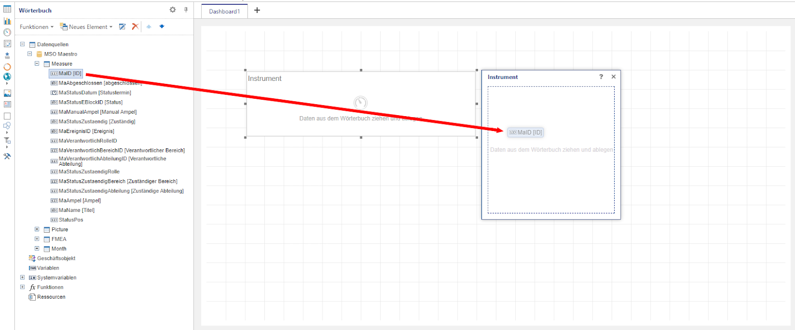
As soon as a data column has been selected, additional editing options appear. On the one hand, the displayed value can be calculated using mathematical operators (Sum: sum of all values; Avg: average value; Min: smallest value; Max: largest value; DistinctCount: Number of all unequal values; Count: Count: number of all values; Median: median of all values). On the other hand, the type of instrument can also be changed, which adapts the visual display. A total of five different display modes are available: “Full round disk”, “Half round disk”, “Linear (vertical)”, “Linear (horizontal)” and “Sphere”.
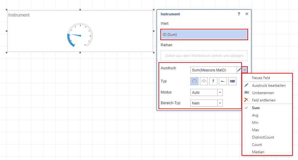
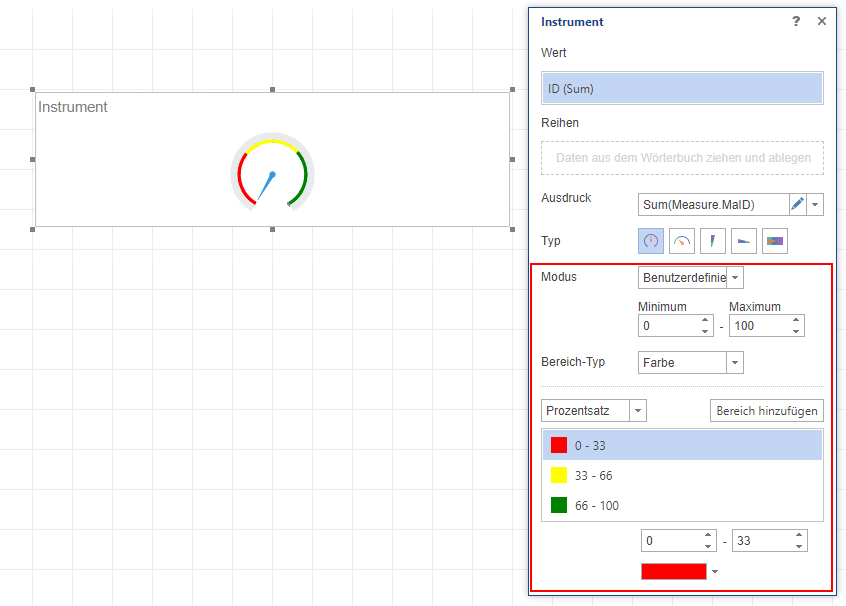
If “User-defined” is selected instead of “Auto” mode, the displayed interval [minimum value; maximum value] can be entered manually. In addition, you can also select “Color” instead of “No” for the area type, whereupon different colors can be assigned to different, individually definable areas.
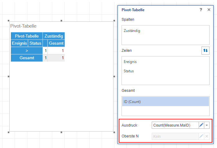
3.2.2.5 Pivot table
Using a pivot table, data within a table can be grouped, totaled and displayed hierarchically depending on several arguments. A new pivot table can be drawn in the dashboard via the “Insert cells” tab and the “Pivot table” selection field.
As soon as the placeholder for the new pivot table has been inserted, any number of data columns from the dictionary can be defined as columns and rows of the pivot table using drag & drop.
Note: The hierarchical grouping of the columns and rows depends on the order entered.
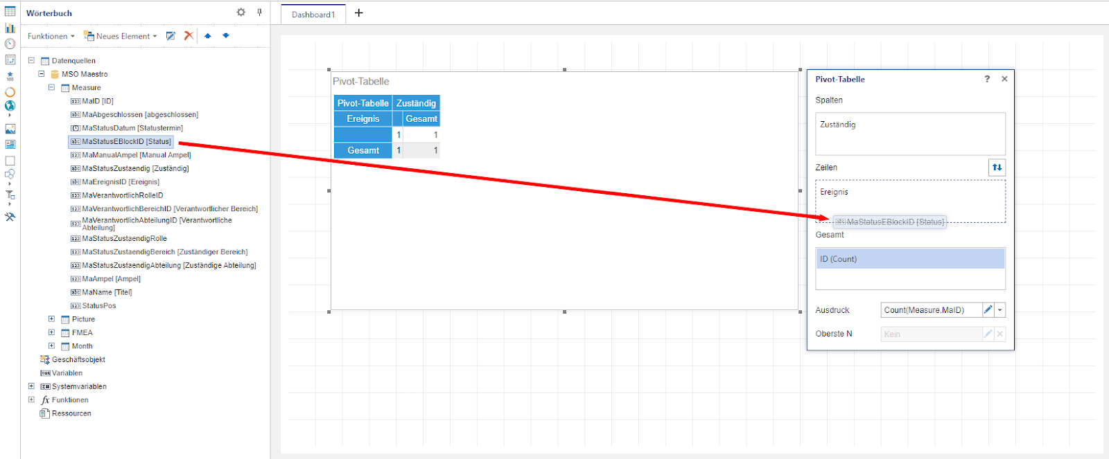
Once all columns, rows and the value content (total) have been entered, additional settings can be made. With regard to the columns and rows, the “Top N” field can be used to specify whether the number of displayed elements should be limited to a certain value.
With regard to the value content, you can determine how it is to be calculated. By clicking on the small triangle symbol, the expression can be extended by the corresponding mathematical operators (Sum: sum of all values; Avg: average value; Min: smallest value; Max: largest value; DistinctCount: Number of all unequal values; Count: Count: number of all values; Median: median of all values).
3.2.2.6 Indicator
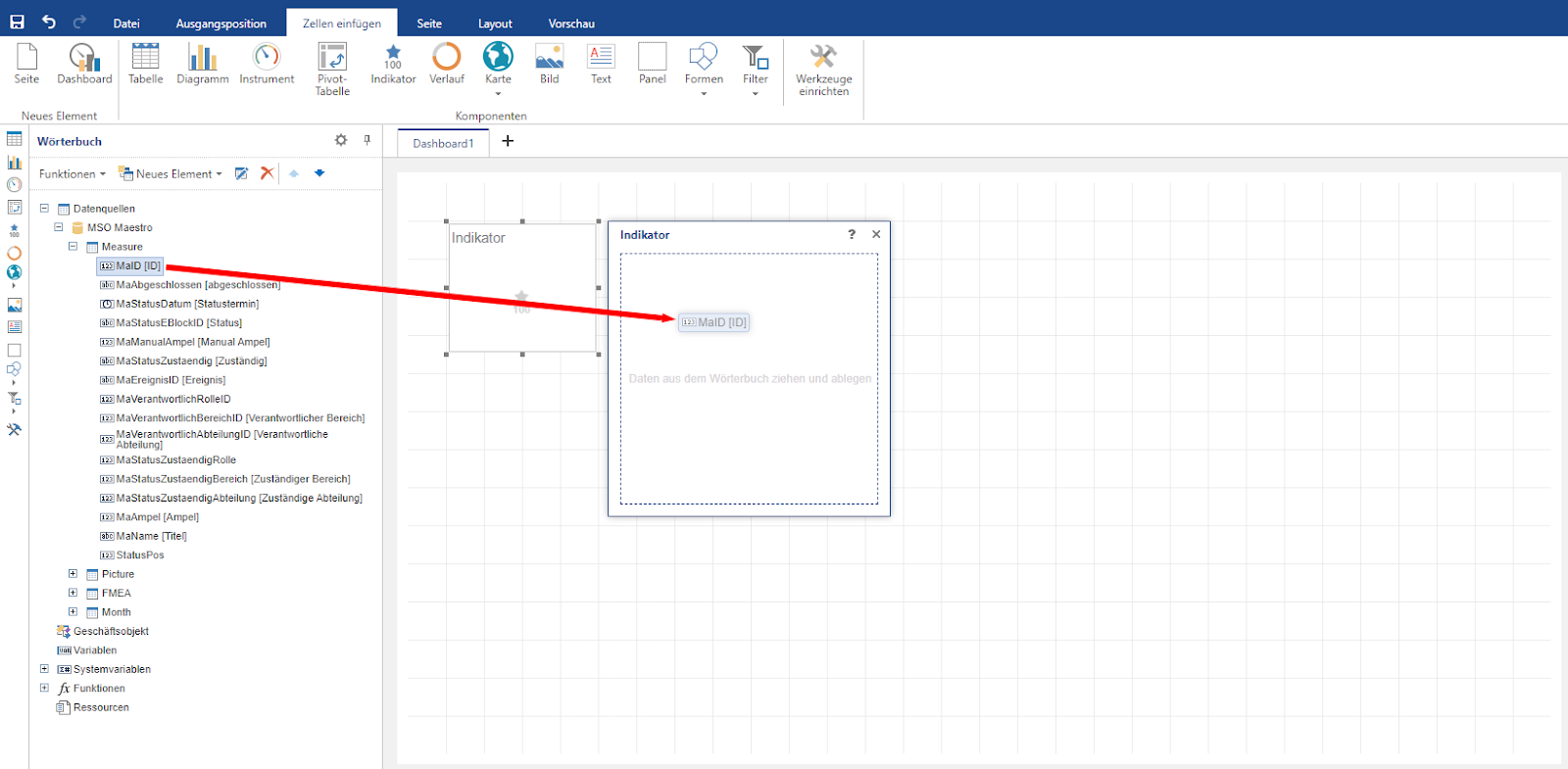
Indicators make it possible to display a value. It is also possible to output the percentage deviation of this value from a specific target value. To be able to use an indicator, the “Indicator” field must be selected in the “Insert cells” tab and a corresponding position drawn in the dashboard.
The data column from the dictionary from which the indicator (value) is to be calculated can then be dragged and dropped into the element. Optionally, another data column can be added, from which the target value is derived.
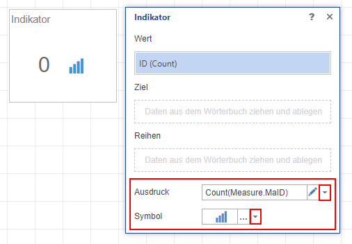
You can then determine how the value of the indicator should be calculated. To edit the expression, simply click on the triangle symbol and select one of the available mathematical operators (Sum: sum of all values; Avg: average value; Min: smallest value; Max: largest value; DistinctCount: Number of all unequal values; Count: Number of all values; Median: Median of all values). In addition, you can also select a symbol and its color, which is displayed next to the indicator.
3.2.2.7 History
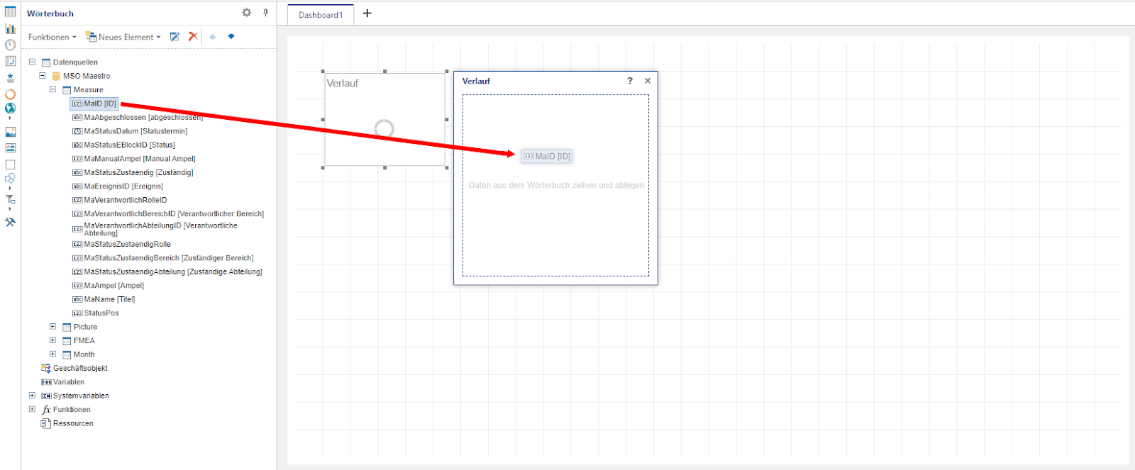
A graph can be used to display a value in relation to a specific target value. To add a gradient to the dashboard, activate the “Gradient” selection field in the “Insert cells” tab with a mouse click and then draw the desired position in the dashboard.
As soon as the element is in the dashboard, a data column from the dictionary can be set as the value and another data column as the target via drag & drop. If no target is specified, the progression is always 100% and therefore makes little sense. Instead, it is advisable to use an indicator at this point.
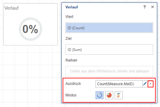
Once a data column has been selected for both the value and the target, you can then specify which mathematical operators (Sum: sum of all values; Avg: average value; Min: smallest value; Max: largest value; DistinctCount: Number of all unequal values; Count: Count: number of all values; Median: median of all values) are used to calculate the value and the target and in which mode the display should take place. A total of three modes are available for this, circle with centered percentage display, pie chart and data bar with percentage display.
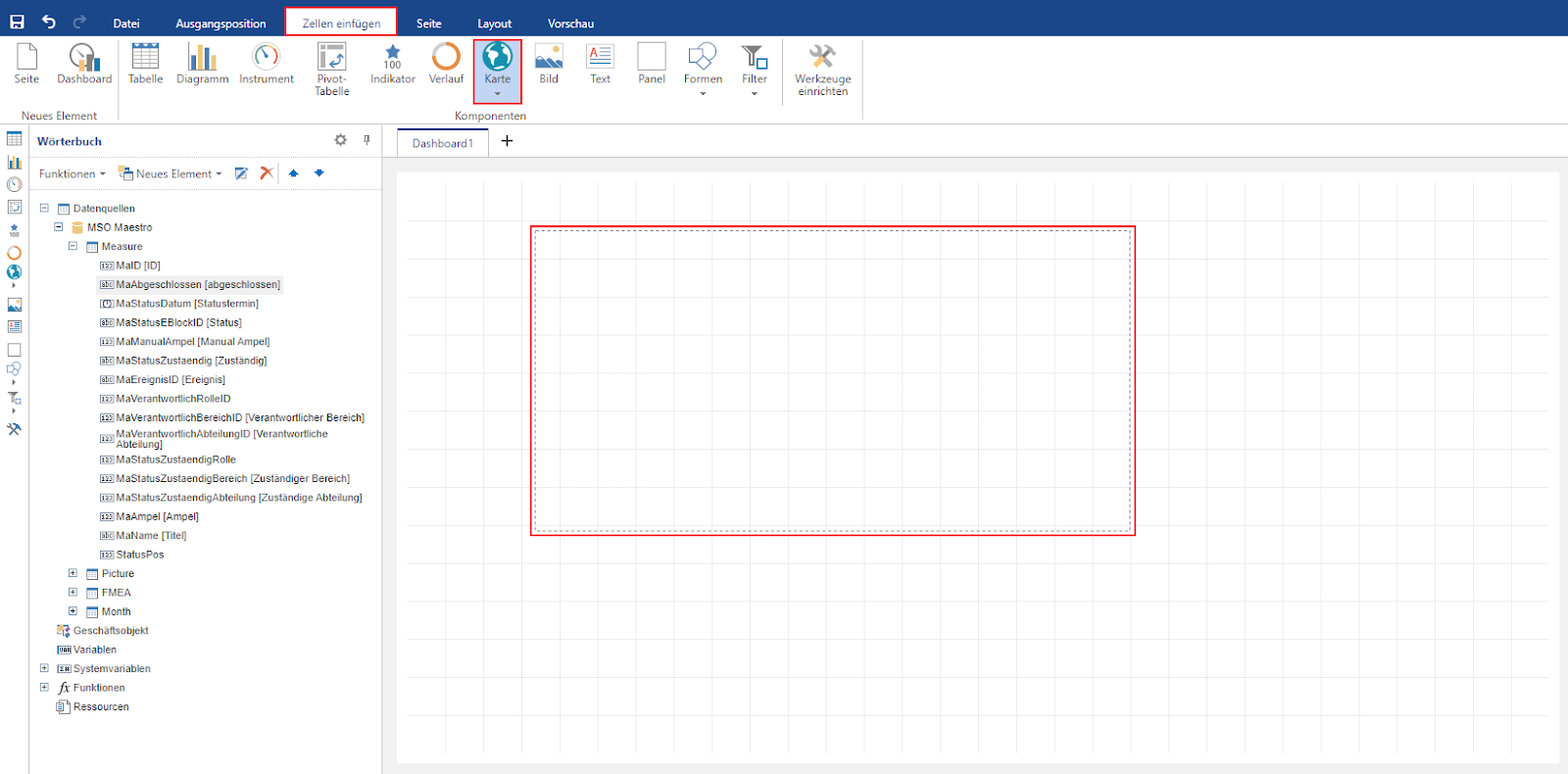
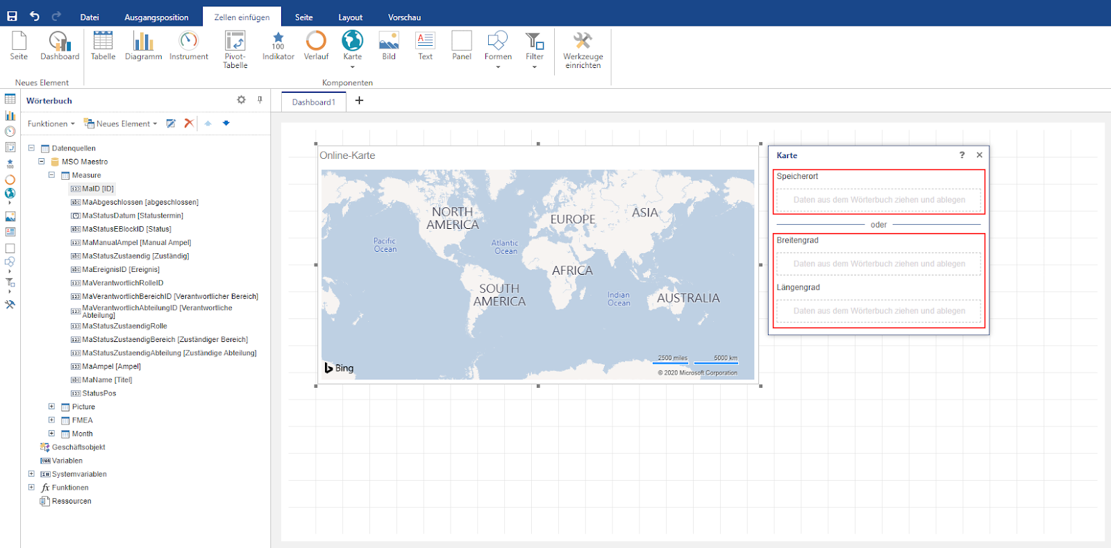
3.2.2.8 Map
Maps can be used to visualize values depending on a specific location. There are basically two different maps available for this purpose. You can use a schematic map of the region or an online map (Bing). To call up one of these two maps, select the “Map” field in the “Insert cells” tab with a mouse click and then select the corresponding map. The map can then be drawn in the dashboard.
Region map:
After the map has been inserted, it is advisable to first select a suitable map section (default: USA). You can then specify whether the values should be generated manually or on the basis of a data column in the dictionary. The prerequisite for the values to be displayed depending on a data column is that a column exists that corresponds to the correct English spelling of the respective country.
If the Data column option is selected, at least one column with the “Key” (= name of the country in English) and another column with the value must be added via drag & drop. The expression for calculating the value can be calculated using the available mathematical operators (Sum: sum of all values; Avg: average value; Min: smallest value; Max: largest value; DistinctCount: Number of all unequal values; Count: Count: number of all values; Median: median of all values).
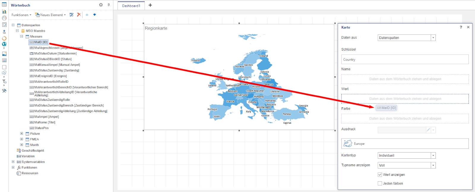
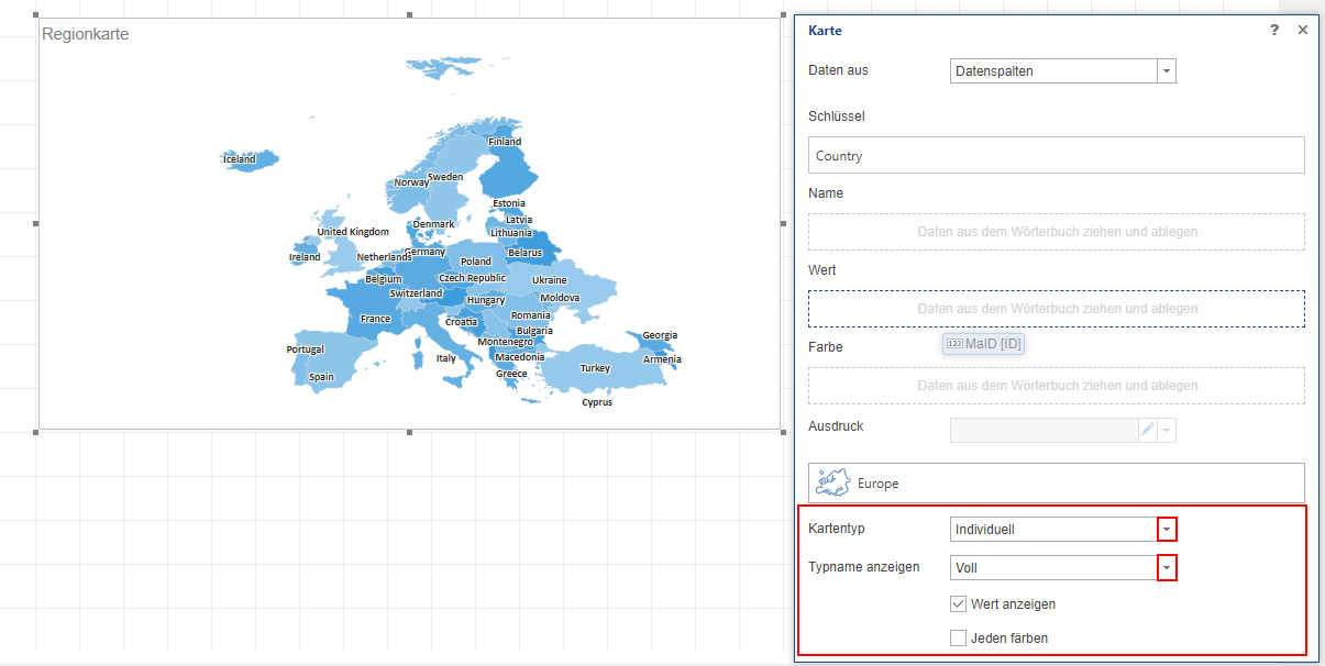
You can then select one of the four map types, Individual (color assignment based on a data column), Group (color assignment grouped by a data column), Heatmap (color assignment depending on the height of the value), Heatmap with groups (color assignment depending on the height of the value and grouped by a data column), and decide whether the country names should be displayed in full length or abbreviated.
Online map:
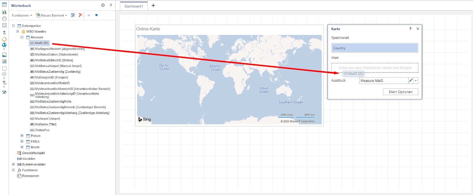
Once the placeholder for the online map has been inserted in the dashboard, it can be filled in two different ways. Either two data columns with the corresponding coordinates (one column with the longitude and another column with the latitude) are added via drag & drop or a single data column with a specific location (country name, zip code, …).
You can then select the data column from the dictionary from which the value to be displayed for each location results. The triangle symbol can be used to edit the expression and thus start the calculation of the value using the available mathematical operators (Sum: sum of all values; Avg: average value; Min: smallest value; Max: largest value; DistinctCount: Number of all unequal values; Count: Count: number of all values; Median: median of all values).
In contrast to a regional map, an online map offers additional editing options. These can be called up by clicking on the “More options” button. The map can be customized using the four parameters “Page view mode”, “Type”, “Culture” and “Colour”.
Page view mode: Definition of how the value is displayed. One of the four available modes, “Bubble” (bubble size per location depending on the size of the value), “Value” (value as a simple number), “Symbol” (value as a simple number next to a self-defined symbol) and “Diagram” (display of the value depending on an argument in the form of a pie chart), can be selected.
Type: Selection of the format (country name, zip code, …) of the selected data column for defining the location.
Culture: Determine in which language the countries/regions should be displayed on the online map.
Color: Definition of the color highlighting of the individual countries. You can select the same color for all countries (Flat), a different color for each country (Color each), colors depending on a group affiliation (Group), or a specific color for each country using an additional data column (Value).
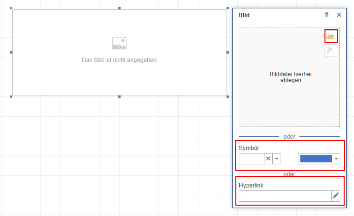
3.2.2.9 Image
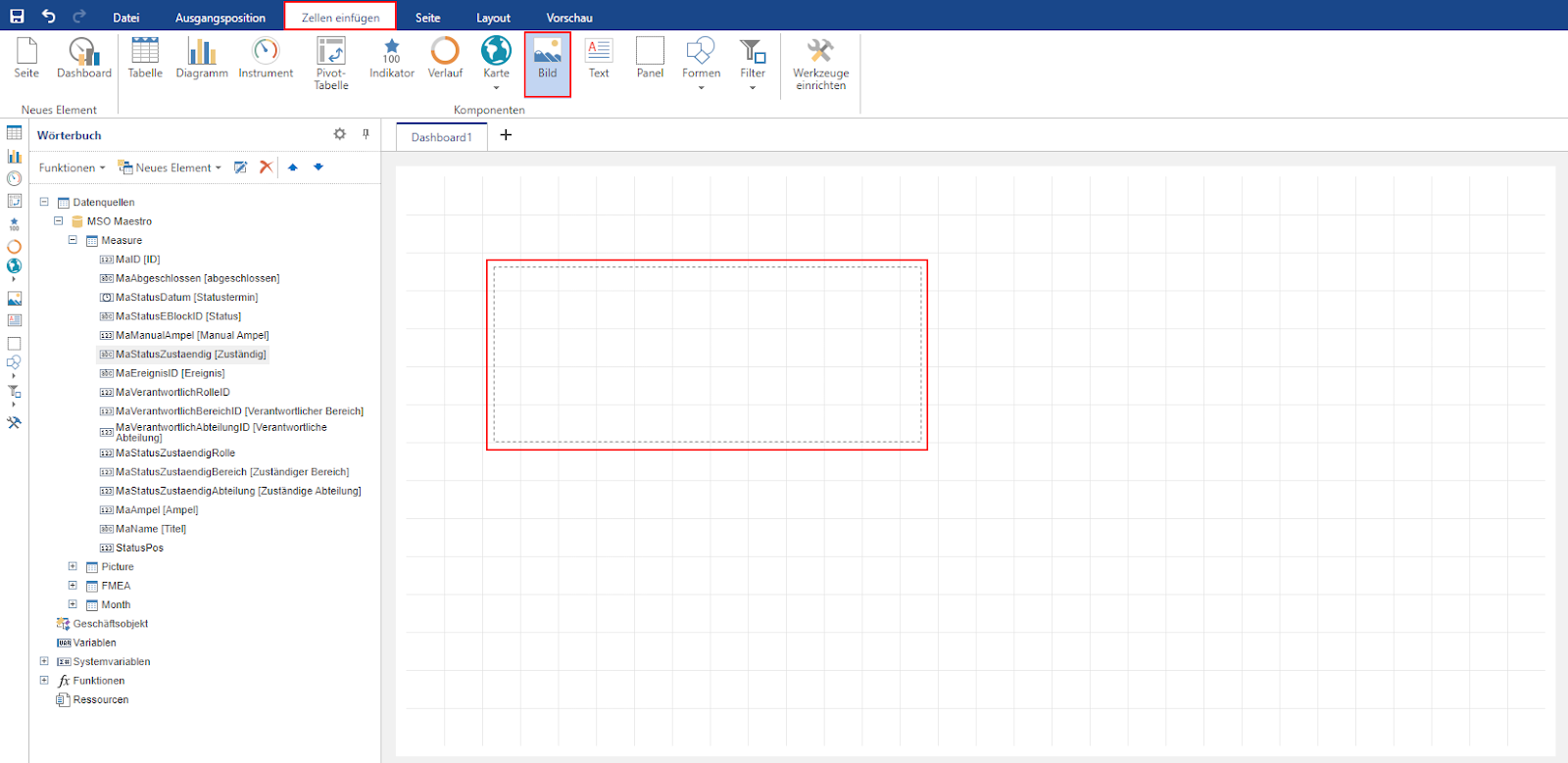
There are then three options for filling the image field with a corresponding representation. A local image file can be integrated into the report using the folder icon. Instead, you can also display one of the available symbols with the selected color or enter a hyperlink.
To display a local image saved on the computer in the dashboard (e.g. company logo, background image, …), a corresponding image field must be inserted. To do this, activate the “Image” selection area in the “Insert cells” tab with a mouse click and then use the mouse to draw the positioning of the element in the dashboard.
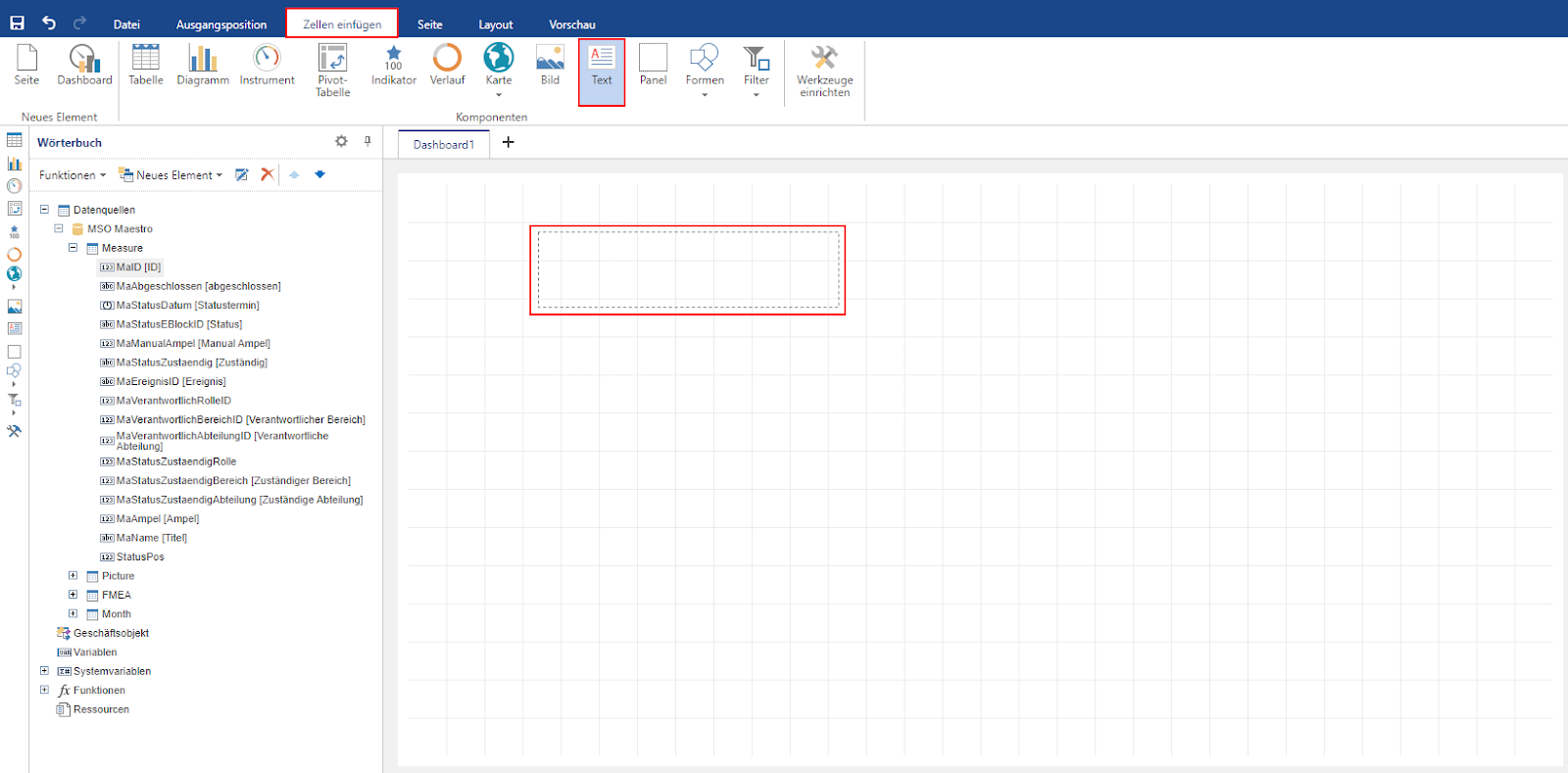
3.2.2.10 Text
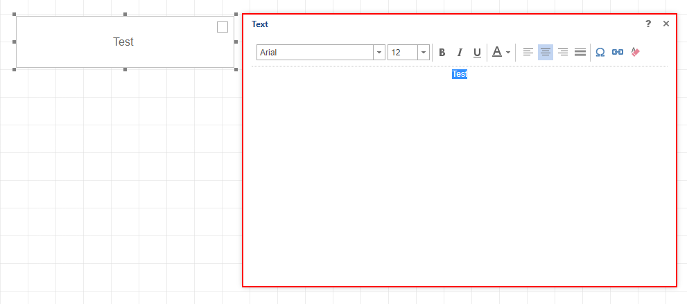
To be able to insert a new text field, you must be in the “Insert cells” tab in the menu bar. As soon as the “Text” button has been activated there, the placeholder for a new text field can be drawn in the dashboard.
The editing window for text entry then opens automatically. Any text can be entered here and formatted accordingly. In order for formatting changes to be applied to a text that has already been entered, the text must be selected.
3.2.2.11 Global filters
Adding global filters makes it possible to limit all dashboard content to specific data. If the “Insert cells” tab is active in the ribbon, the desired filter can be selected by clicking on “Filter” and then drawn into the dashboard.
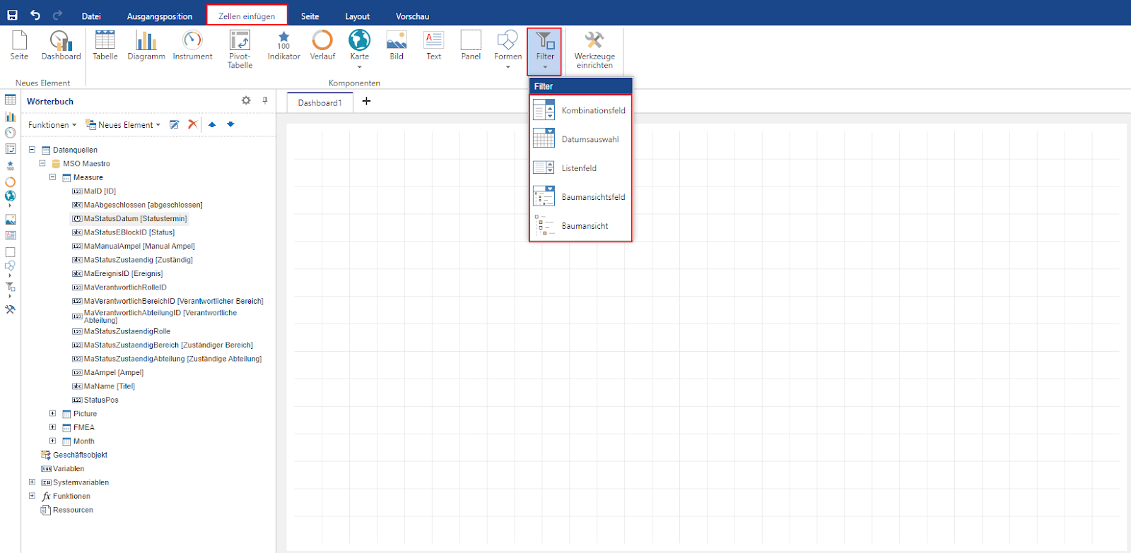
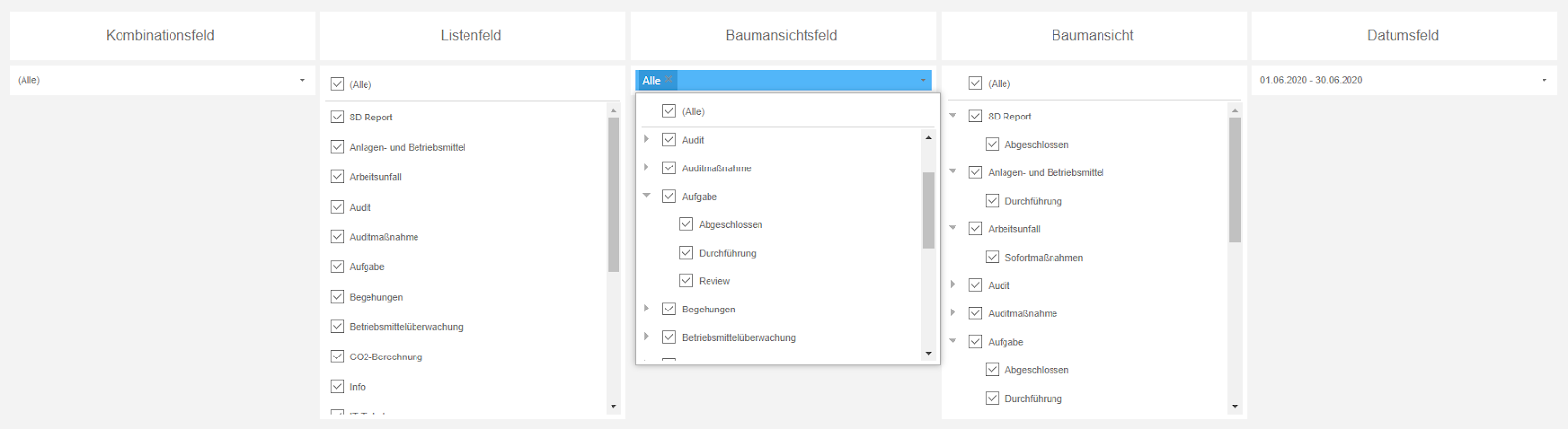
You can choose between a total of five different filter types, “Combo box”, “Date field”, “List field”, “Tree view field” and “Tree view”
Combo box: Filter option with regard to an element. Filter must first be opened by clicking with the mouse.
List field: Filter option with regard to an element. Filter is already open in list view.
Tree view field: Filter option for several elements that are hierarchically linked in a tree structure. Filter must first be opened by clicking with the mouse.
Tree view: Filter option for several elements that are hierarchically linked in a tree structure. Filter is already open in list view.
Date field: Filter option with regard to a date field using a calendar.
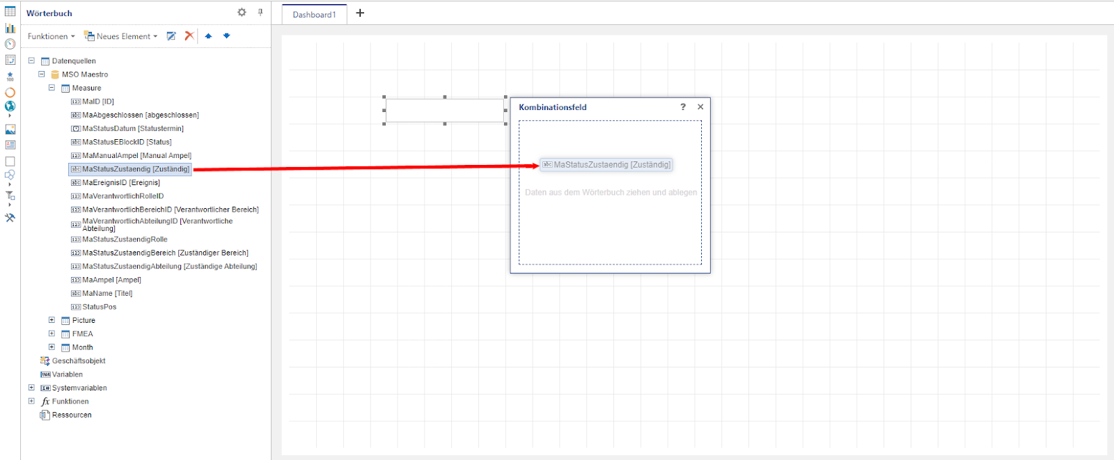
As soon as a filter has been selected and a corresponding placeholder has been drawn in the dashboard, the data column from the dictionary that is to be used as a filter attribute can be added via drag & drop.
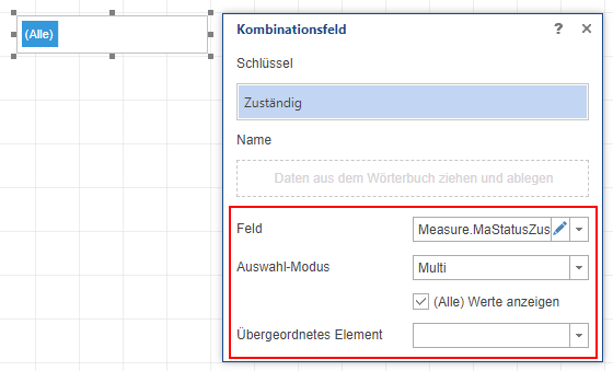
As soon as the desired data column has been added from the dictionary, further optional settings can be made for the filter. You can specify whether only a single or multiple selection is permitted for the filter (selection mode). If the “(Show all) values” checkbox is selected, the filter is given the value “(All)” if no other selection has been made. If more than one filter element is used, the filters can also be linked to each other, provided that one filter is selected as the parent element for the other. This ensures that only the selection options that match the filtering of the parent element are available for the child element.
3.2.2.12 Predefined filters for individual elements
In some cases, it can be useful to filter a specific element in the dashboard to a limited amount of data in advance, but not to apply this filter globally to all elements (e.g. displaying an indicator with the number of all measures in arrears ? Filter: Measure in arrears). Such a filter function is available for each element and can be edited by clicking on the funnel symbol after activating the element.
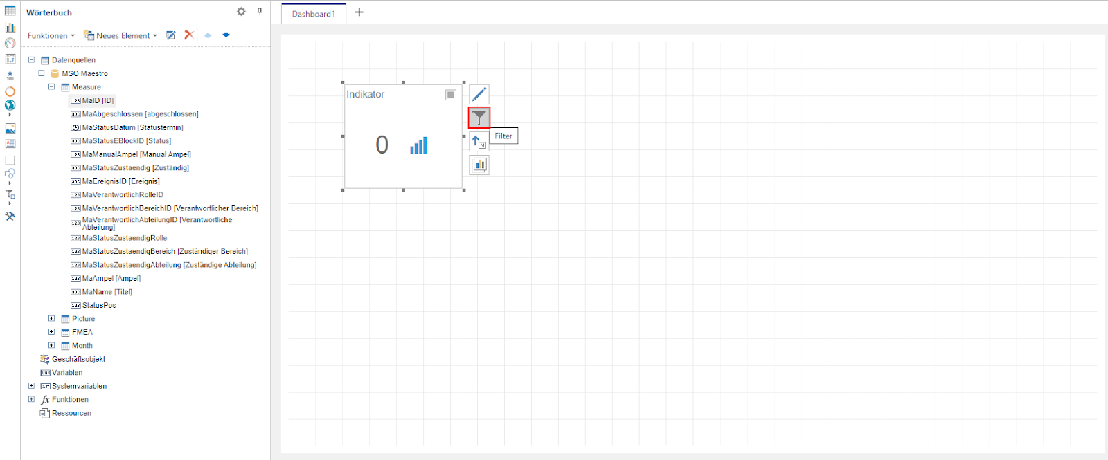
The data column to which the filter condition is to be applied can then be dragged and dropped into the filter field.
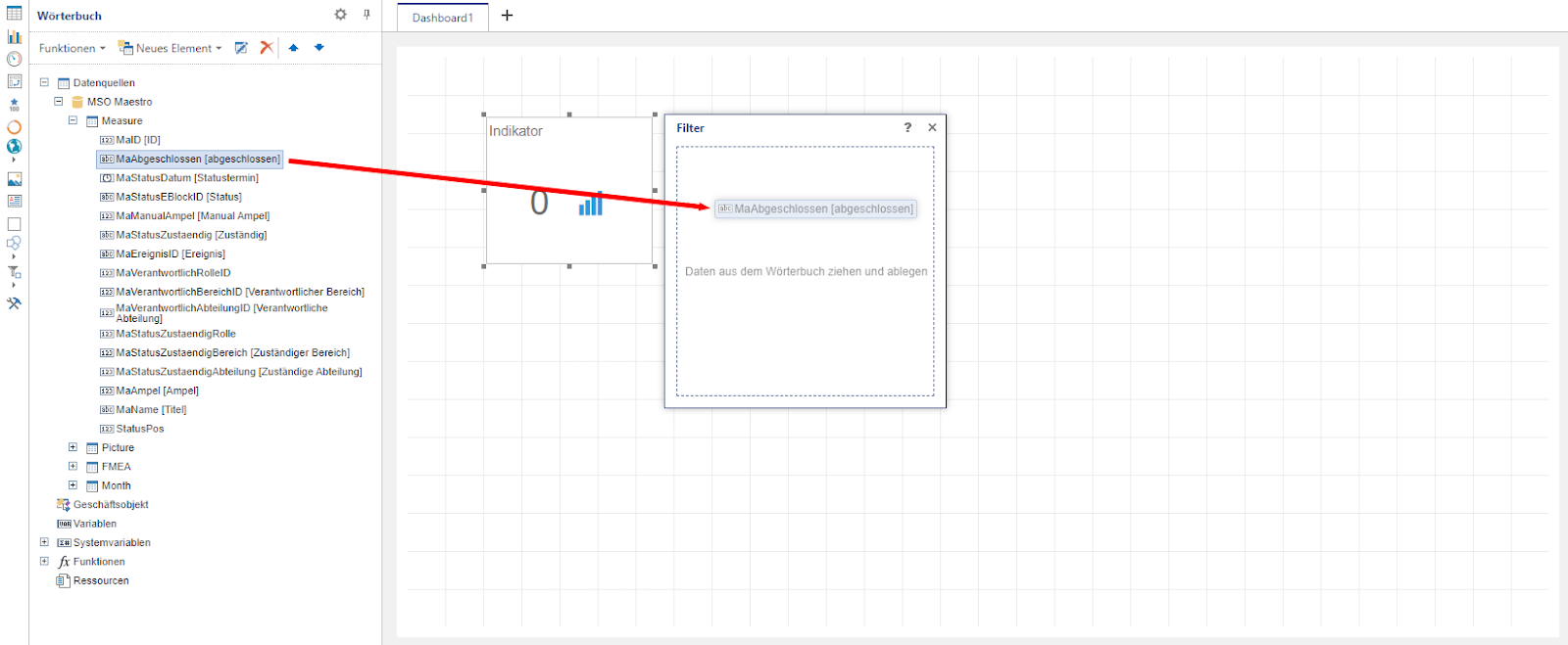
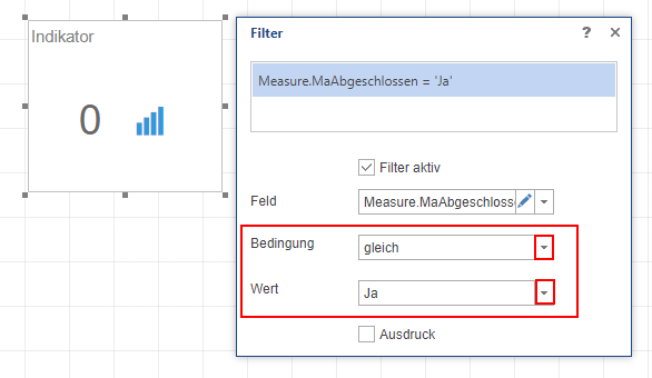
To define a filter condition, a corresponding condition and the corresponding value must be selected. Only data that fulfills this filter condition is then taken into account in this diagram/element.
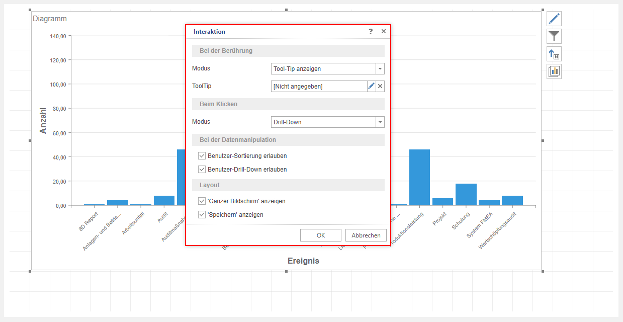
3.2.2.13 Interactions
A major advantage of dashboards is that interactions between individual diagrams on a dashboard can be defined with ease. A major advantage of dashboards is that interactions between individual diagrams on a dashboard can be defined with ease.
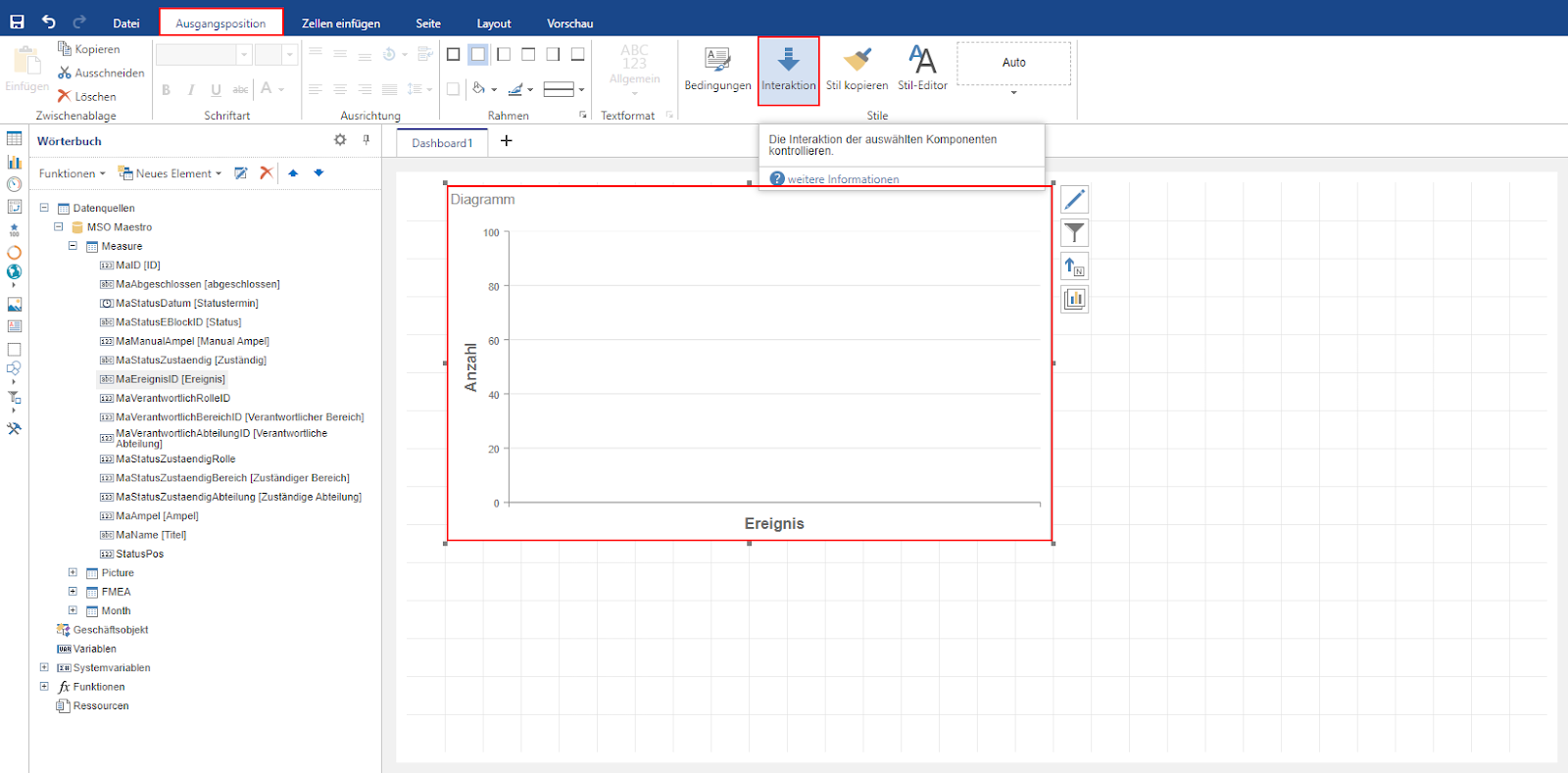
The editing window for the interaction behavior of the respective element then opens. Depending on the element type (diagram, table, map, …), the setting options for interaction vary. In a diagram, for example, the interaction settings are divided into four sections:
On touch: This defines how the diagram behaves as soon as an element of the diagram is touched with the mouse but not clicked.
- Mode = No: Nothing happens when an element is touched.
- Mode = Show tool tip: When the element is touched, its value is displayed or an expression/text defined as a tool tip.
- Mode = Show hyperlink: When an element is touched, a hyperlink is displayed which is opened as soon as the corresponding element is clicked. However, the prerequisite for this is that the “Open hyperlink” mode has been selected in the “When clicking” section.
On click: This defines how the diagram behaves as soon as an element of the diagram is clicked.
- Mode = No: Nothing happens when you click on an element.
- Mode = Dashboard: Clicking on an element opens another dashboard that has already been created. However, no filter settings are applied.
- Mode = Open hyperlink: Clicking on an element opens the stored hyperlink.
- Mode = Apply filter: When you click on an element, its argument is applied as a filter for all other elements of the dashboard.
- Mode = Drill-down: Clicking on an element displays a lower hierarchy level. This only works if several arguments are assigned to the diagram. For example, if the “Event” and “Responsible” arguments are assigned to the diagram and the “Drill down” mode is activated, only the “Event” argument is initially displayed in the diagram. As soon as a specific event is clicked on, all responsible persons who can be assigned to the corresponding event are displayed. In addition to several arguments, the “Allow user drill-down” checkbox must also be activated.
For data manipulation: This is where you define which options the user has to change the data in the dashboard. It can be determined whether the user can sort the data (Allow user sorting) and use the drill-down function (Allow user drill-down).
Layout: Here you can specify whether the user should have the options to display the diagram/element in full screen mode (“Show full screen”) and to save it (“Show save”) (see chapter 2).